Changelog
Follow up on the latest improvements and updates.
RSS
Global merchandising just got a whole lot easier. If your team plans across multiple regions and currencies, you know the pain of manually converting prices before they ever hit a plan — not anymore.
Our new course dives into everything you need to plan like a pro across currencies: setting unit cost, retail, and ticket values in each cluster's own local currency, using custom exchange rates so your future plans reflect real planned rates (not a static one), and switching between Metrics and Reporting views to see your numbers however you need — cluster by cluster or rolled up into one currency for clean cross-market comparisons.
We've also packed in the configuration and data side of things: how actualized data flows into Toolio with exchange rate, how to set up custom exchange rates so your plan reflects real, planned rates rather than a daily default, how to configure those rates at the cluster level, and how everything gets stored under the hood in your organization currency so rollups and metrics stay consistent no matter which currency you're viewing.
Whether you're planning your first international launch or just want a refresher on how currency flows through AP, this one's worth 15 minutes of your time.
Head on over to Toolio Academy to learn more!
improved
Item Plan
🗂️ Scenario Sections in Item Planning
What's new
Scenario sections are now available in Item Planning too. Group related scenarios into sections the same way you do in Merchandise Planning — and since both modules use the same scenarios, they share the same sections.
What you can do
- Create a section in Item Planning– Click Add Section at the top of the Change Scenarios or Show Other Scenarios menu and give it a name.
- Move a scenario into a section– Open Scenario Options → Change Section and pick a section, or choose No Section to move it back out.
- Select a whole section at once– In Show Other Scenarios, each section has a single checkbox that selects or clears all of its scenarios; a dash shows a partial selection.
- Reorder by dragging– Drag scenarios and whole sections to set the order they appear in your plan; a section's scenarios move together as a block, and your plan columns follow the same order.
- Use one set of sections everywhere– A section you create in Merchandise Planning appears in Item Planning, and the other way around.
Why it helps
- Keep Item Planning scenario menus tidy, no matter how many scenarios your team maintains.
- Organize scenarios once and see the same grouping in both Merchandise Planning and Item Planning.
- Your plan columns read the way you arranged the menu, so comparisons stay easy to follow.
Learn more in the Scenario Planning help article.
improved
Intelligence
AI
🕓 Ask Toolio's AI about your change history
What's new
You can now ask about recent changes to your plans in plain language — like "what changed this week?" or "who's been editing this scenario?" — and get a clear answer. Ask Toolio's built-in AI, or your own AI assistant connected through the Toolio MCP Server. No more exporting a log to piece together what's been happening.
What you can do
- See recent activity at a glance– Ask what's changed lately and get the latest edits, who made them, and when.
- See who did what– Ask who's been making changes and get each person and the kinds of actions they took, most recent first.
- Scope to a timeframe– Ask "what changed this week?" and narrow the answer to that period.
- Focus on a scenario– Ask about changes in a specific plan scenario to see the activity there.
- Ask from your own AI assistant– Connect Toolio through the MCP Server and ask the same questions from Claude or another AI assistant, right alongside your other tools.
Why it helps
- Keep a pulse on recent planning activity without exporting a log.
- Know who's been in a plan and what they've been doing, right before your weekly review.
- Meet your planners where they already work — in Toolio, or in the AI assistant they already use.
>
Note:
Available where Toolio's AI assistant or the Toolio MCP Server is enabled; full change details are visible to admins.improved
Assortment Plan
Allocation
📏 Rate of Sale now respects each location's size range
What's new
Rate of Sale (ROS) is now calculated only from sales of the sizes that fall within the size range applying to what you're planning. Sales of out-of-range sizes no longer feed the rate or the Good Weeks evaluation. This applies in both Assortment Planning and Allocation.
How it works
- Assortment Planning– The calculation uses the offering's Size Range. If none is set, every size in the sales history contributes.
- Allocation– Each location uses its own effective size range: a per-location override when set, otherwise the strategy's Size Range. Locations that share a selling location are grouped and calculated over the union of their in-range sizes.
- No size range, no change– If nothing is set, the rate is simply left unfiltered by size, so every size present in the sales history contributes, exactly as before.
Why it helps
- Cleaner, more accurate ROS: a size you don't intend to carry can't inflate or deflate the rate.
- Consistent behavior across Assortment Planning and Allocation.
- On automatically, with no configuration required.
Learn more in the Rate of Sale (ROS) Calculator help article.
improved
Assortment Plan
Intelligence
AI
Like for Like Forecast
What's new
You can now generate an AI forecast for a new, replacement, or low-history choice by linking it to a similar choice and using that choice's sales pattern as the forecasting input.
What you can do
- Link a similar choice– Open the target choice's Offering Set, go to the Similar Choices tab, right-click an eligible similar choice, and select Link Choice (Like for Like Forecast).
- Forecast without sales history– Run forecasting and the system generates an AI Forecast for your choice using the linked choice's historical demand pattern, even if your choice has no sales data of its own.
- Review the result right away– The generated forecast is available for review inOriginal AI Forecast Unitsas soon as the run completes.
- Relink or unlink anytime– Point the link to a different similar choice, or remove it, whenever the comparison no longer fits.


Why it helps
- Get a realistic forecast for new or replacement products before they build up any sales history of their own.
- Keep historical sales data clean — linking never copies or alters sales records for either choice.
- Stay in control of the Forecast Type — unlinking keeps the choice on AI Forecast until you decide to switch it back.
Learn more in the AI Forecast help article.
improved
Merchandise Plan
🗂️ Scenario Sections in Merchandise Planning
What's new
You can now group your scenarios into sections in Merchandise Planning — the same way you organize your views. Related scenarios stay together, and your scenario menus stay tidy no matter how many scenarios your team maintains.
What you can do
- Create a section– Click Add Section at the top of the Change Scenarios or Show Other Scenarios menu and give it a name.
- Move a scenario into a section– Open Scenario Options → Change Section and pick a section, or choose No Section to move it back out.
- Select a whole section at once– In Show Other Scenarios, each section has a single checkbox that selects or clears all of its scenarios; a dash shows a partial selection.
- Reorder by dragging– Drag scenarios and whole sections to set the order they appear in your plan; a section's scenarios move together as a block.
Why it helps
- Find the right scenario quickly instead of scrolling one long list.
- Keep working plans, forecasts, and snapshots grouped the way your team thinks about them.
- Your plan columns follow the same order you set in the menu, so comparisons read the way you arranged them.
Learn more in the Scenario Planning help article.

improved
Assortment Plan
📍 Distinct Location Count metric on Assortment Plan
What's new
Toolio now has a Distinct Location Count metric in the Assortment Plan. For any choice, it shows how many distinct locations sell that choice in a given week, on both a Plan and Actual basis.
What you can do
- Add Distinct Location Count to your Metrics tab and reporting views, alongside the existing Distinct Style, Choice, and SKU Count metrics.
- See how many locations carry each choice in a given week, for both Plan and Actuals.
- Roll it up correctly over time and across your product hierarchy. A location that sells a choice in multiple weeks is counted once, not summed.
Why it helps
- Understand how widely each choice is distributed, not just how much it sells.
- Compare planned vs. actual location coverage to catch choices that are under or over distributed.
- Bring location breadth into your assortment decisions as a first-class metric.

improved
Intelligence
📌 Pin and share the partition you're working on
What's new
When you open a
Size
, Sales
, or Location Curve
and select a partition, Toolio now keeps that partition pinned to the top of the partition list, shows it in the panel title, and lets you link straight to it.What you can do
- Keep your place— the partition you select stays pinned (and highlighted) at the top of the list, so it stays in view while you review its spreads or contributions, no matter how long the list is or how far you scroll.
- Know what you're viewing— the panel title now shows the curve and the selected partition (for example,Men / Footwear), so it's always clear which values are on screen.
- Jump straight to a partition— your selection is saved in the page link, so you can bookmark it or share a link that opens the curve with that exact partition already selected.
Why it helps
On curves with many partitions, it was easy to lose track of which one you had open once the list scrolled. Now your selection stays put, the title keeps you oriented, and you (or a teammate) can jump back to the exact partition in one click — less scrolling, fewer mis-clicks, and faster reviews.

improved
Assortment Plan
Allocation
Jump straight to the right size curve partition
What's new
When you open a size curve from the Assortment Plan or Allocation Plan, it now takes you straight to the partition that matches the choice you clicked — instead of always dropping you on the first one. And any partition you're viewing now has its own shareable link.
What you can do
- Open the right partition in one click– Click "Open size curve" from a choice in the Assortment Plan or Allocation Plan and land directly on that choice's partition.
- Share a link to an exact partition– The link updates as you switch partitions, so you can send a teammate a URL that opens the precise partition you're looking at.
- See where you are at a glance– The panel title now shows the partition next to the curve name (e.g. "Spring Dresses / Kids - Clothing").
- Trust the fallback– If a choice doesn't map to a partition, you land on the first one and get a clear heads-up instead of quietly seeing the wrong data.
Why it helps
- Skip the manual hunt for the partition that goes with your choice.
- Point a colleague straight to the exact partition you're discussing.
- Always know which partition you're looking at without second-guessing.
improved
Assortment Plan
📏 See a choice's actual sizes right on the Assortment Plan grid
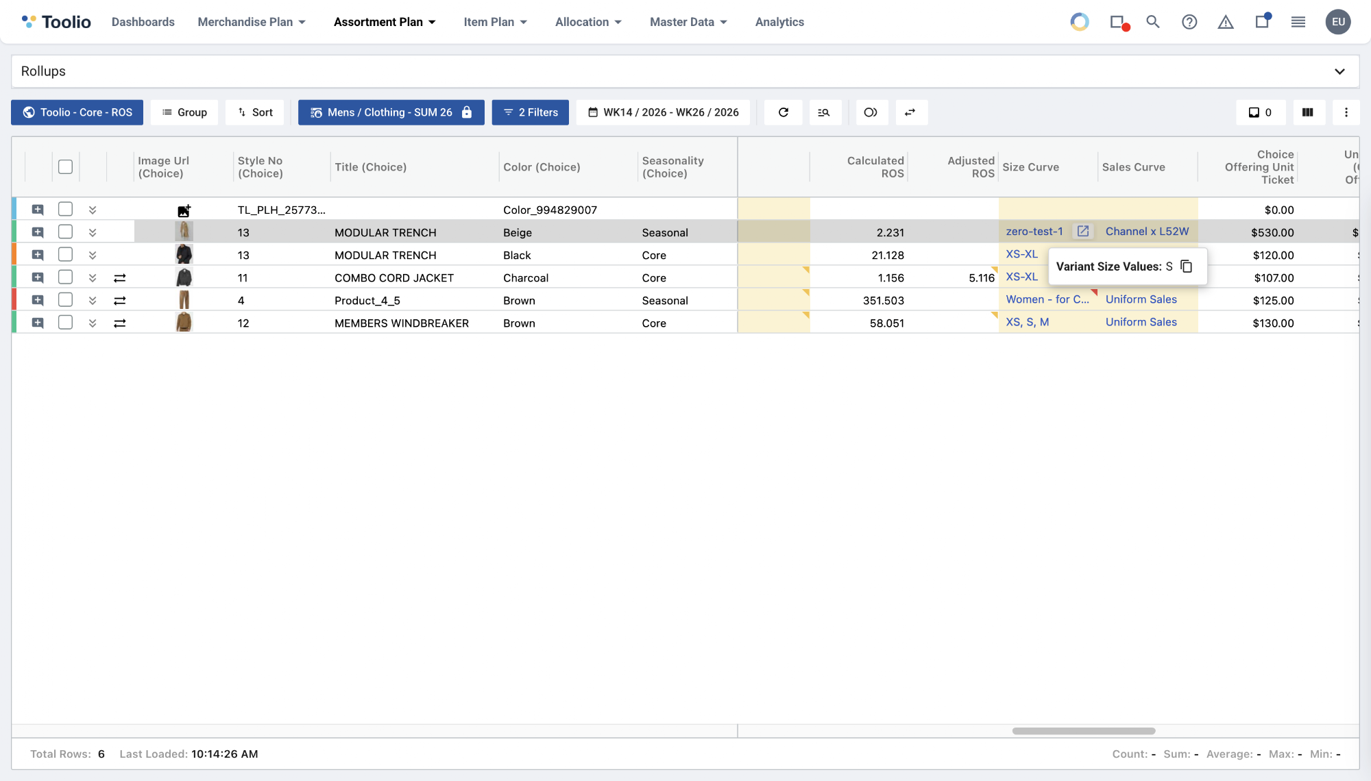
What's new
Hover any cell in the
Size Curve
column on the New Assortment Plan grid to instantly see the actual variant sizes
a choice's assigned product carries — with a one-click copy
button. The same size details (Variant Size Values, Size Curve Size Values, and Size States) now also appear in the choice status Validations → Details
panel even when size selection passes, not only when it fails.What you can do
- Glance at a choice's real sizes right on the grid — no need to open the Offerings panel or wait for a validation error.
- Hover a Size Curve cell to see Variant Size Values, Size Curve Size Values, and Size States together.
- Copy any size list to your clipboard in a single click.
Why it helps
Until now, a choice's real sizes were only visible by digging into the Offerings panel — or when a size-validation check failed. Surfacing them directly on the grid lets you spot-check size coverage and catch mismatches while you plan, without breaking your flow.
Load More
→